Social Media Metrics for NonProfits - Facebook

It would appear that the only engagement lift this nonprofit association gets is when posts are promoted for recruitment or to get members and non-members to participate in an activity, and by promoted, I mean to say that we have to pay Facebook a scaled nominal fee each time we want to promote an event. The worthwhile metrics aren't tied to views, reach or engagements; but rather followers who become active, paid members; and subsequently those who renew their membership status year-over-year.

When I joined this professional association group at the start of the year, we had just over 1,500 followers. We now have roughly 1,890 followers; though no real data to benchmark how we are gaining or losing followers, e.g., as a result of event or new membership promotions.
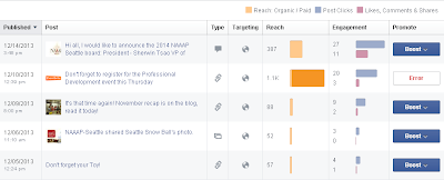
Facebook's default report dashboard
Facebook's default report dashboard for latest posts
The table for engagement by latest posts pretty much tell you what common sense tells you. Compared to the total reach (number of followers), the individual posts have practically no traction with our members. And, the only times when we show some measure of reach is when we pay to promote certain event posts.

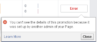
One thing to watch out for is how your whole community page or association page is setup on Facebook, because in the above example with the latest posts, you might be the administrator and manage access; but you won't have any access to detailed reports if you didn't setup the promotion yourself. Now, tell me Facebook, how is that sane?
A typical reporting error in Facebook. It begs the question,
why can't all admins see the same reports?

iOS 7: The Cool Things About This Update

Aside from the Gmail app crashing totally and rendering my unproductivity even higher, I can say that the rest of the embellishments that made it into this version of the user interface are more than just eye candy. In no particular order, here are the ones that caught my eyes:

  • Yahoo! Weather. If you have this native app configured to show different cities, there is now animation tied to whatever is going on in those cities. Beijing, for example was foggy, and fog drifted across the screen. The same is true for night vs day, or cloudy (clouds drifting), and when the rains come back to the Pacific Northwest, droplets of rain will probably be washing the augmented reality screen. A big plus: moon phases, sunrise and sunset times are in.
  • Clock. Before, you might have thought that this was a static display; and now a red seconds needle also shows.
  • Compass. The compass itself got a facelift, which looks prettier than the basic compass it used to look like. If you swipe the screen, you get a digital level which can be used if laying the smartphone flat on a table, or on its side for say, hanging a painting.
  • Camera. You can take stills, video, or panoramic -and- select the image type (e.g., monochrome, noir, instant, fade, chrome, etc) from the same camera window. No more fiddling with embedded menus. Yay!
  • Calendar. Before, it looked pretty much like blocks and arrows, right? Now you can scroll through the calendar year or quickly look at past or future years. It is a slight improvement; though I liked the simplicity of the older calendar feature.

iOS 7: Things You Should Know About this Update

If you are a Gmail app user and you update to the current version, you may notice a few things. Like, Gmail ceasing to work. Much of my day was spent like this:

Delete. Reinstall. Delete. Purge cache. Reboot. Reinstall. Delete app. Delete acct instance within native mail app. Reinstall. Add gmail acct back to native mail app.

I found out a lot about the new features. I mean really, who has time to read Apple release notes? I spent a lot of time looking at the settings and turning all the new things "off". 

Is offering a discount enough?

"Your mystery offer is waiting <checkmark symbol> it out". That was in my inbox this morning from Shutterfly. Thank goodness Google Mail rendered the symbol correctly; though I wonder how many customers got the question mark instead for that special character insertion. I would think that I am already a customer since I made a purchase earlier in the year and while Shutterfly might have marketing automation capabilities, whoever is managing how content is delivered to customers and prospects is doing it from a batch and blast perspective; which is okay if your company fits one of the following scenarios:
  • a consumer products oriented company with a high churn rate
  • customers respond better to discounts because you've conditioned them to expect it
  • your company is a market share leader in its industry, and you simply don't care about losing existing customers
  • your CEO dictates the marketing plan
  • your products are more of a commodity than a premium brand
Before and after purchasing from Shutterfly, I'd always gotten promotional emails and like most consumer emails they are spammy...meaning I get more than four per month. And to top that, all the discounts have been in the 40% to 50% range or free products (e.g., 12 free thank you cards, free photo magnet, free photo book, etc.). It makes me think that their loss-leader costs are minimal.

Take this Shutterfly email as an example. What do you see?
Shutterfly promo email from 2013-08-22

If you saw in the email preview screen that you only got up to 40% off for buying something from Shutterfly, you might just be in the 90% who would see just that. However, if you were really tuned into promotional offers, you'd see that it's up to 40% in addition to existing sale prices. Which did you see, the former or the latter response? If you saw the former, chances are you deleted the email since it didn't look any different than any other Shutterfly promotion. If you saw the latter, it might take you a second glance to see if you really saw the right offer and perhaps that is enough for you to click through. 

If this is a totally new offer (as in, this product pricing scenario has not been used with new customers), the offer needs to be called out in a color other than black text on construction yellow. The italicized black text is still more of the same. This is a callout for the "on top of sale prices" to be in a different color. It's hard to tell though if such an offer would really impact Shutterfly's media plan without having the production data. And, it is just one offer campaign out of dozens that Shutterfly runs each calendar quarter.

Brand Marketing: Naked Juice

Acquisitions between food/beverage companies happen largely without public knowledge. What companies like PepsiCo (Naked Juice) and Coca Cola (Odwalla) excel at is marketing, advertising and distribution. If you think you were fooled by the Naked juice brand, don't be. The product first launched in 1983 by the Naked Juice company. After PepsiCo's acquisition of them in 2007 is when product composition radically changed to meet the demand for mass distribution and consumption. It may have been cost prohibitive to sustain the founding mission of Naked Juice. However, that's not to suggest that there has been a slowdown in how the products are marketed and branded. In fact, packaging redesign is credited with propelling Naked Juice to become a nationally-recognized brand for all natural fruit smoothies that anyone can buy at the grocery store.

A recent $9 million fine for improperly labeling their juice products as "all natural" is a mere slap on the wrist since the brand portfolio was worth more than $150 M by product sales at the time of acquisition. The only thing to be learned here is that PepsiCo (and others like them) will adjust marketing content on their product portfolios to say less of what government regulations expect for product packaging and more of what consumers respond to. Is dropping the words "all natural" really going to influence how PepsiCo produces these juice products? Not likely.

What will happen to a juice product that can no longer claim nor brand itself as "natural"? The week's tweets are filled with chatter about the out-of-court settlement by PepsiCo about the Naked Juice portfolio. Food/beverage companies in similar situations have largely come out of such lawsuits mostly unscathed by public opinion. "All Natural" becomes "with natural ingredients". 

Read more?
FTC's Guidelines/Laws Regarding Truth in Advertising
Shook, Hardy, & Bacon LLP's Food and Beverage Litigation Update [PDF]

Google Feature: Lookup Calories in Wine

I'm sure this set of features has a name for it other than a Google search index feature; but I thought it was pretty neat to see. Besides instantaneous information on earthquakes, currency exchange rates, and basic math formulas, did you know that you can lookup how many calories in a 5 oz glass of cabernet sauvignon too?
Nutritional Information on Wine using Google Search

This is what comes up with the basic query of "wine calories"; but when you add more qualifiers to the search box, the standard output of search listings just shows. So, no nutritional display for queries like "white wine calories" vs "red wine calories". There's a mix of types of red wines in the caloric drop-down box; plus a general entry for "wine" which isn't terribly descriptive nor helpful. But, that said, who is really going to drink 5 oz of wine at dinner? A typical dinner with wine will run you at least 400-500 calories per meal. Hope you are adding in extra exercise to burn off those additional sugar calories.

New and Vastly Improved Google Maps

Looks like Google engineers have been busy adding some interesting features to how directional maps are served up. Besides the usual car, transit, and walking routes, there is now a route for bikes which takes you between cities on surface streets. A good feature to have in bike friendly neighborhoods like Portland, Minneapolis, or Boulder.

The addition of clickable icons on a street map is nice to have. If I had to guess, I'd say that the companies, parks, bus stops that appear on the map are from existing data points that users either put in themselves (like adding a company's office or HQ to the map) or Google was able to bulk upload to their data universe. The fantastic feature here is being able to pinpoint a company's location within a complex of buildings, like at a mall. The example below is of the Bellevue Square Mall in Bellevue WA.


2013-06-23, Bellevue Square Mall Snapshot
2013-06-23, a pretty clean list of driving suggestions
The biggest quirk I can see is when the map engine tries to give a solution to a transit route that makes no sense. If you don't start with a transit center as a starting point, you could get transit routes that take up to 8 hours. The custom date/time setting for a future route is a bit clunkier than what was there before with a separate popup for it. Transit to Everett is not an option with wait times and in-transit time being up to 1.5 hours each way; who has that kind of luxury? It is still faster by fossil-fuel-burning car, though mostly because it would be a reverse traffic commute.
Ugh. Most of the time, you see, is from walking!
I am not going to walk 2.8 miles a day when it is
25 degrees out and sleeting.
Electric Mirror, used in this example, is a topic for a different post. The company manufactures Vive(tm), which is a Bluetooth-enabled TV mirror (a mirror when not in use, a television that fits in the space of a mirror; how neat is that??) Their global HQ is in Everett and I am just using their location in this example.

I wonder if hills are taken into consideration for walking directions. The walking route is impractical in this scenario.
2013-06-23, Walking directions from Bothell to Everett


Indirectly asked: what could we be doing better?

This is a nagging topic on the minds of a lot of marketers this year; in addition to making marketing automation work like a mad SQL (sales qualified lead) generating tool. With respect to direct, email, or online marketing, what seems commonplace to me as a marketer might not be apparent to others who have had mixed results with their campaigns. Let's start with a basic approach: email marketing.

Batch and blast works well for generalized content or for product announcements. But, for that personal touch, as in do it with customer service like you really care... try sending your customers a personalized, non-sales oriented email about a birthday, anniversary, or a special gift just for them.

Ask customers to engage with you in online conversations, participate on polls or surveys, or get feedback on their experiences. It doesn't hurt to ask for their input. What do you think about the new features we put into ___. How does your website redesign look?

When I ask other marketers how many touches they send out to their prospects and active customers, I get a variety of answers. The most I've heard of (including autoresponders from newsletter signups or web form submissions) on the B2B side is 15-20 touches per prospect per month. Ouch, I don't think I'd want to be on the receiving end without an unlimited data plan for my connected devices. This is when planning out content and using a scheduling calendar really helps when releasing time-delayed content. Some premium features of marketing platforms even offer limiters on how many times a lead or contact can be contacted within a set period of time. And, you can also manage frequency when setting up a demand automation funnel as well for handling MQLs and recycled SQLs.

And last of all, your prospects and customers are just like you and me. We have a finite amount of time to devote to activities like reading email; especially promotional or content that adds some richness to our daily lives. Be mindful of how (often) you send out content.

/stepping off the soapbox/

Shared Office Space

I'm a bit intrigued by the shared office workspace being pitched by PivotDesk at Seattle Tech Meetup. Seems to take the contract management and billing hassles out of subletting office space, coupled with the host office providing other services (utilities, high speed internet, conference room, etc) which might not defray actual overhead costs.

Certainly there are far more pros than cons for the Guest; I'm not sure what else the Host office gains out of this arrangement other than a monthly sublet fee paid to them.

Above the Fold

Nearly every web and SEO expert will tell you that this concept simply does not matter anymore now that screen sizes have grown considerably and users subconsciously don't notice the effort it takes when swiping around on a tablet or other portable Internet-capable device. It is necessary under certain web conditions that may or may not be under your control in a web content management system. It is an archaic means of enticing people to buy a newspaper, where all the juicy content or eye-grabbing make-you-read-it-there stuff was on the top half of the front page. But have we, as humans, evolved enough to break away from generations and centuries of reading content this way? It was only natural when the web adopted this type of lure for its own viewers. Some viewers will scroll down if they find that content is usable and valuable to them.

I managed a corporate e-newsletter that, when printed, came out to be five pages long. A partner vendor had complained that I slotted their offer (a free Photoshop plug-in) at the bottom of the newsletter; and when it came down to metrics, they were pleased by the results (more than a thousand click-thrus to their website; the top offer by unique clicks for that newsletter issue). Feedback from other partners report similar successes. It's not where your content is on that page. If it is relevant to whoever is looking and speaks to their needs, it will sell.

Who does the content matter to? It depends on who you're trying to sell that content to. And by selling I don't mean an outright purchase, I'm talking about time and consideration of that content by a prospective user or customer. I had shifted content around putting our most relevant new content at the top of the newsletter, like a new product announcement, case studies, a new online community that we started to host and curate, followed by partner content, and then by partner offers. The perception here was to change how the newsletter was seen internally by the company. If I highlighted the awesome stuff the company was doing, then word-of-mouth would spread. Well, that was the idea anyways.

Is slotting all your valuable content above the 600px line the right design approach for your newsletter, landing page, or website? I have to say, err no insist, that it depends heavily on the audience you are trying to attract and how you intend to make a sale.

Seguetech.com had this interesting image about offers and the fold: 

It'll work for most types of websites out there, from professional services to K-12 software to potluck blogs, etc.

I find all this mildly amusing considering that every site I've researched that suggests the contrary about the "above the fold" has their primary subscribe or call-to-action or contact us above the fold. It makes me think that above the fold is still very much relevant.

Read more?


Book Review: The Crowdfunding Bible

Crowdfunding is a popular means of starting up a business or funding a project. In 2011, $1.5 B was raised through crowdfunding and $2.8 B was projected to be raised in 2012. Equity-based crowdfunding, where a portion of the company's future profits are up for grabs, is becoming more prolific. The question that remains to be answered is how much funding can be raised without registered brokerage firms before the SEC steps in and regulates this type of financing activity.

This free ebook comes from Scott Steinberg, who is the author of "Crowdfunding Businesses and Startups: The Ultimate Guide", a Huffington Post article which is a harmless plug for the book. There's also an accompanying video.

Crowdfunding and crowdsourcing are not new models; but I have taken an added interest in it because there is quite a lack of business and marketing support for those who do get their projects or startups funded this way. I like how this book is structured and it has a whole section dedicated to questions that entrepreneurs need to be asking of not just their own projects but also the ones that were successfully funded. Even if you get funded it doesn't mean that your project will succeed with its deliverables.

It was also interesting to see how quickly funding can be eaten away by unforseen risks. The example posed in the book is of Warballoon Studios that raised $37k to make iOS and Android game Star Command.

What's good about the book is that it offers solid pre- and post-funding project planning ideas and tips for each stage of crowdfunding, from creating an effective video pitch to building effective rewards. The best part was the Q&A section of the entrepreneurs who got funded.

Read more?
VentureBeat's Kickstarter failures infographic (41% of projects fail, even when funded)

Pre-populated Web Contact Forms

I don't know what's worse at the moment, being forced to register for each real estate website where I want to browse a listing or having fake contact data pre-populate when an online account is generated by an agency's contact management system. From time to time, I'll comp neighborhoods around where my rental is located to see if housing prices of the existing home supply (vs new housing starts) are rising, falling, or staying the same. The web contact form lead wall with Keller Williams is just one of those examples of a poorly thought out lead generation plan. I'm not sure why their web form thought I'm from NY, but it does. Unfortunately I have seen this type of web form behavior before where the back-end software captures and saves the contact info of the most recent transaction; in this case, a user from NY.

Here is an example of a pre-populated customer account that you probably don't want replicated with your own website:
Keller Williams: post-login from new account creation, user account profile
And, to make it worse, you actually do have to check your account profile to see what email items the opt-in signs you up for because while there was only one checkbox to opt-in for email marketing, there were three options from KW. See below:

Surely, much success can be attributed to this lead gen program in terms of quantity of lead generated and number of validated email addresses that are added to one's in-house or partner email list. But, I'm not sure what they really mean by a trusted mortgage partner. There's also no double opt-in upon signing up, like a confirmation of an email address for starters. That's bending the opt-in rules a bit. Banks, insurance, and credit card companies do it all the time because they have subsidiaries or divisions that do partner-like activities. Also, there's no mention about a privacy policy or data usage policy on a user's account profile, or how to find out more info about it.

It's unclear from the web page's source code if this is a home-grown web form or hosted by a third party provider. I'm not terribly inclined to check out other KW agency websites to test this out.

Snail Mail and Why We Love It

Why marketers love it is because it's a very well established mailing standard. Every property (and even those with just a box) has a postal address and you know that when spelled and annotated correctly, it has a 100% chance of getting delivered intact and mostly on time to the intended recipient, "to our neighbor", or "valued customer".

Why people love it is because it is an interactive communication piece with a tactile response. It's even better when it's personalized just for you; and, for the most part, it doesn't matter if it comes from a business or from a friend, although we like the latter part even better.

There are a lot of "standards" that just haven't died; although some who believe that everyone should be connected to everyone else online all the time want you to believe that it already has. The radio (118 yrs old). Fax machine (163 years, or for modern purposes 63 years). Libraries. Copiers. Telegrams. Land line telephones, etc.

Despite how traditional is trending against digital, according to the Direct Marketing Association's 2012 Response Rate report, the cost per order or lead acquisition costs were about the same regardless of the method used: direct mail ($51.40), postcard ($54.10), email ($55.24), and paid search ($52.58). Hmmm. Makes one wonder what's going on here.

It basically boils down to this:


Email
Mail
Phone
Lower response
Higher response
Highest response
Lower cost
Higher cost
Highest cost

Every marketing channel has its pros and cons, but what marketers and new entrants in the market need to be aware of is a) who you are trying to reach, and b) how much are you willing to spend on your campaign.

Foursquare Day

For those of you who may not know (or care), April 16 is Foursquare Day; largely an event promoted by mobile for Foursquare users to meet and mingle at various places. But, this post isn't about that. It's about their visualization tool that shows what you've done for a year. There are just four preset visualizations and they aren't all that helpful for anyone, including the user. If only I could download this or geographically see where I've been, or what cities I've been to have the highest concentration of unlocked badges. The Foursquare network is still growing and provides an alternate means of tracking hyperlocal ad redemption.
A Foursquare Visualization.
Pretty cool looking, utterly useless


Another Foursquare Visualization.
This one shows quantity by venue type,
with no indication if you've visited a place more than once.

Google Treasure Hunt - Map Layer

Even for an April Fool's joke, this is a pretty neat map layer feature. Google Maps already allows you to view terrestrial maps at street level, terrain based, or from above via satellite imagery. This map view reminds me of ye olde mappes that one would find in a pirate or seafaring game. The below image is a screenshot of the greater Seattle area. Nicely done Google.
An April Fools treasure map display from Google,
the marked spot on this map is a trailhead at Cougar Mountain
near Issaquah, WA
Google's promo video for this feature is very amusing:

Google Takeout

Looks like Google is pulling the cord on its RSS Reader. It isn't as bad as it sounds. There are plenty of other RSS readers out there. Frankly, their RSS works a lot better than say Google News which I wish offered more customization. If you have a lot of subscriptions that you keep up on, say between the Wall Street Journal, NY Times, or the various food or business sections of other major newspapers, keyword or new blog post alerts, Google's other lesser known service Google Takeout lets you download an XML archive of your subscriptions and feed settings.

Takeout isn't limited to just the reader, you could download a backup of Google Drive, Blogger, Picasa, or Youtube for example.

To access Takeout, simply access one of Google's web services, say from Google Reader:

Go to Settings / Reader Settings / select the Import/Export tab

Then click onto the link below which reads: Download your data through Takeout

Bait and Switch


Southwest Airlines' March Facebook campaign is currently promoting $59 one-way flights. Except, I can't fly out from a major metro area to another major metro area for that price. And while $93/flight is a good price, it's not even close to the sweet FB deal. This is a good way to tick off customers who aren't loyal to the brand. What's worse is that the landing page that houses this offer has the cities in alphabetical order; a logical way to default sort it, but the flight prices are so not on "sale" for most one-way flights. I feel like I've been misled, again, by a deceptive sponsored ad.

The sponsored ad starts pretty well with all the right components in it that communicate brand, offer, and a call-to-action.

Sponsored Ad screenshot, 2013-03-08
And then, after the hook (click-through), the experience quickly nosedives into the ground.
Landing page mirrors the FB-pushed ad. Good right? Keep scrolling down...
You think you are going to get a good deal, until you can't actually find a deal for your metro area. Seattle, for example:

If Southwest had used regional ad targeting on FB,
I would not have been pitched this offer.
Maybe? One could only hope social media ad tech advances to this level.


Real-time Crowd-sourced Incident Dashboard

Because the stakes are high (loss of life, financial disruption, loss of property), many countries, cities, and private citizens have devoted time and resources into developing this global network of seismic tracking and archiving.

It would be great if an easy-to-use interactive dashboard for businesses tracked activities such as real-time sales pipeline flow, new product activation or purchases, campaign effectiveness, budget vs actual spends, etc. The visualization below is from the USGS and it tracks all earthquakes that happen around the world. It can be filtered to show either all magnitudes or 2.5 M and above, and within the last 7 or 30 days. And, this map display has evolved over the past several years to what it is today. There is a beta mobile version of it, though it doesn't seem to spew out useful data to a casual observer. 

USGS: real-time display of 2.5M earthquakes
While there aren't major fault lines running through the Pacific northwest like in California, this regional display (click to view) shows where earthquakes have occurred in the last two weeks.

Interested in other data projects from the USGS? Here are a few more links that show how the earthquake data is crowd-sourced:

Event: Ignite Seattle

I am often amazed about the courage these people have to stand up in front of a large crowd and talk about their passion.

As a newcomer to the metro area, I am fortunate for having stumbled upon the Town Hall venue and this particular event. Imagine watching 15 speakers, allotted 20 slides that automatically advance every 15 seconds for a total of 5 minutes speaking time, talk about a subject, business idea, traumatic experience, life experience, or why no one should eat cheese. What I liked about it was that the speakers were able to succinctly do their storytelling in an engaging way (through slides) that made us (the audience) care about their story.


As for myself, do I have a passion I could talk to a crowd about, and would it be inspirational to others? I have no idea. I've always thought that my life and work passions could intermingle; though I'm not sure if I can separate the idea of a hobby from a passion from a side project. I have few of the first, an undecided part on passion, and many side projects.

One of the speakers' advice was: don't think, just do

Save the date: May 16, that's the next Ignite Seattle at Town Hall (8th & Seneca)

Want an extra $5 on your Starbucks Card?

If you are unfamiliar with the Starbucks rewards card system, you might not know that you can transfer balances between Starbucks reward cards. Say if you got a stray $5 gift card from a promotion or as a holiday or workplace perk, you could take that balance and port it over to your regular Starbucks rewards card (or account, if you are using their mobile app for purchase transactions).
Starbucks promo email, 2013-02-20

When it comes to content and design, the Starbucks email and accompanying rewards landing page are minimalist. The content certainly does do the job of providing a meaningful amount of information that has a targeted call-to-action which encourages a user to do other steps, maybe check into what else Starbucks is offering, check on reward status or account balance, etc.

What you might not know is that you can also transfer a balance from a cash gift card, say a $100 Visa gift card to your Starbucks rewards card at any Starbucks-owned kiosk or store. And, if you're a Coinstar customer, you can convert your deposited coin balance to a Starbucks rewards card without incurring any service fees.

Want to know how they're tracking this campaign? By product SKU and registered reward card swipes at the register. This is an online/mobile campaign to drive in-store purchases.

And, if you're an avid coffee drinker, this is a darn good deal for 1 lb of whole bean coffee. 'Nuff said.

Weights and Measures

I was thinking about corn this morning and came to the realization that while I had the vague notion that corn commodities were measured in bushels, I hadn't thought about what that meant until I looked it up online. As it turns out, when the tv news channel reports about bushels of wheat or bushels of corn, they aren't referring to the same measurement. Corn used to be measured by volume, where one U.S. bushel of corn was equivalent to eight dry gallons of kernels.

One bushel of measurement is not the same for different types of grains and seeds. These differ from corn in that they are also measured by weight and moisture content. To understand how moisture content affects unit, pricing, and weight, let's use fresh chestnuts as an example. It takes roughly six weeks (according to Allen Creek Farms) to convert freshly harvested chestnuts into dried chestnuts (less than 15% moisture content) in order to store dried chestnuts or to grind it into flour. One pound of whole dried chestnuts can then be reconstituted into two pounds six ounces of rehydrated chestnuts, for culinary purposes.

Here is a basic guide to how other bushels are measured:
  • oats: 32 lbs (in the US) or 34 lbs (in Canada)
  • barley: 48 lbs
  • malted barley: 34 lbs
  • shelled corn at 15.5% moisture by weight: 56 lbs
  • wheat at 13.5% moisture by weight: 60 lbs
  • soybeans at 13% moisture by weight 60 lbs
That said, the next time you are in a discussion about weights and measures or someone casually asks for your definition of an "order of magnitude", it is best to ask what definitions are being used.

Target Ad Audience and Branding

I don't follow football, or much of sports for that matter except for the Olympics. The only time to tune in for Superbowl Sunday is to watch the cacophony of ads. At $4 million per 30 second slot, this is all the more reason to make whatever message your company wants to convey really count. Instead of harping on the truly terribly ads, I thought I might point out ones that really captured my attention. Movie previews are excluded. I looked at things like:

  • Core (corporate) message or product brand easily understood?
  • Speaks value to the right audiences?
  • Feel good? Wacky? Clever?
  • Did the end of the ad drive another campaign action?

Worth Mentioning to Others:

Budweiser: Clydesdales "Brotherhood" - 9.3 million views on YouTube (budweiser)
Jeep: Whole Again with Oprah narration - 1.3 million views (thejeepchannel)
Skechers: Man vs Cheetah - 335k views (skechersperformance)
Audi: Prom - 9.2 million views (audiofamerica)

These ads had multichannel flair, presumably to drive the audience from TV to social media. 

Oreo: Whisper Fight - 1.1 million views (oreo); Choose you side at Instagram (2200 followers before ad aired, post-Sunday almost 50k followers); would have a higher impact if the Instagram purl was advertised

Budweiser: Clydesdales "Brotherhood" - Name the baby Clydesdale (Hope and Stan), tweet name using #clydesdales @budweiser

Speed Stick:Unattended Laundry - 1.1 million views (speedstick); Tweet your #handleit moment

Asus Taichi Ultrabook

This looks promising. My Acer netbook experienced its first black screen of death last night and I had to use my other more powerful dinosaur to create a bios boot on a flash drive. The only noticeable spec difference between the two models for the Taichi is battery life, 5 hrs vs 8 hrs. I like that it has a solid state drive. Though, 128 gb seems paltry compared to my netbook's 400 gb. It would be sweet to deliver a presentation on it without having to turn the laptop around to an audience.
[Update: 2013-04] I went to a Microsoft Store to check it out and quite literally, the unit felt and looked as though someone had slapped an ultrabook and a touch tablet together. To make it worse, when you open the unit like a laptop, the touch screen is on the other side of the viewing screen. Both screens are not touch capable, only the tablet side is, which makes using Windows 8 really uncomfortable. I am not going to swipe with a mouse, tyvm.

Coffee and Soda

The Atlantic reports that soda sales in the US are in a free fall, down 40%, while coffee sales have surged up by 50%. This is not surprising given the health backlash from consumers about sugary drinks; except coffee drinks don't have the same stigmas attached.

There are parts of that article that I did find peculiar. For starters, there's a bit about market share and consumer age. I wondered how many 13 yr olds it took to become a statistically significant data point. There are 14.3% of them (in the age group 13-24) that consume coffee drinks. And, there's no mention about the study or the survey size used. The National Coffee Association does track this, and in their study (or at least the preview of it) for 2012, roughly 3,000 adults in the US were surveyed about their coffee drinking habits, but the age cut-off is 18 or older. There's more about coffee drinking statistics at SBDCNet, a clearinghouse for consumer research.

A Viscountess Salutation

I came across Craghoppers, a UK-based adventure travel clothing company, when visiting with avid travel friends in California this past winter. Whether your passion for travel is for exploring the outdoors or simply wanting to do so in style and comfort, Craghoppers is one of the few manufacturers whose clothing lines do both. Sure, you could cite other US clothing manufacturers that offer competitive products, but when it comes right down to it, there are just a handful who can do at a price point that doesn't turn you into a one-time buyer.

But, this post is about Craghopper's email marketing, which was very amusing when signing up for it. I wonder just how many ordinary citizens enjoy seeing non-standard salutations on their email or postal mail from this company. I would be curious to see what the peak and average transaction value per salutation segmentation this company gets.

Craghoppers.com email sign-up form

Related Posts Plugin for WordPress, Blogger...