Home Depot In-App Augmented Reality

Home Depot rolled out a nifty feature inside their smartphone app. It allows users to imagine finished products in a space. It's also not easy to find and it certainly doesn't reside in the Tools section of the app, even though it could.

Let's say you are shopping for a replacement sink for the kitchen and you find one in the app, simply select the option for "See this in your home" in the product photo display. The rollout of this feature is limited to certain product groups. You cannot, for example, visualize the fit of the 3-person Infrared Sauna in your home using the app.

The only problem is that it only shows the faucet part, and not it's accompanying base. It would be a hassle for the homeowner to find that the base is what doesn't fit in the current sink configuration. Unless you have a diamond drill bit set, drilling the holes yourself through a porcelain sink might be difficult.

There are other tools in the app that you might not be aware of. Anyone could say "of course, that is obvious" but it really is not so obvious. The ones that I really liked are digital Caliper and the Nut & Bolt Finder, where you simply put the object you are trying to match onto your smartphone screen then using your fingers to drag a ruler and the app shows an estimate of the nut or bolt size. Really nifty. Especially when you go to any hardware store for replacement parts and the store assistant says, "What size are you looking for?" and then shows the aisle filled with shelves and boxes of a lot of nuts and bolts.


Home Depot In-App Tool: Nut & Bolt Finder


Bitly's Mobile App Refresh

Apps are suppose to make your life easier, not more complicated. You really know when an app's UI has changed before opening the app when you notice that its app icon has changed. And, Bitly's changed from an outlined orange logo to a dark orange background with the outlined logo in white. Certainly a noticeable change.

In the old Bitly app for iPhone, you really didn't have to do much to save, shorten, and share a link. You could be in another browser or in an RSS reader app and the order of operations used to be simple with few steps:

In a browser or RSS reader, copy the link
Bitly's app would automatically recognize that a link was copied, and take both the Title of the link and the link itself, packaged together on a screen that would allow you to edit or insert a new Title (if needed), then share the link to one or all of your connected social media accounts.

It was:

Copy link / Bitly app automatically shortens / Share link

Now, it is:

Copy link
In the Bitly app, you now need to hit the + symbol to create a link (sadly no automatic detect)
Oops, no title at all. Go back to the browser and copy the title from the article
Go back to the Bitly app, edit the link and paste the title
Then, LEFT swipe (left to right) to share
But, sharing no longer brings up a list of your connected accounts, it just shows the default sharing options that the Chrome browser shows
Share / Scroll sideways through the list of options / Post

Alas, no more Bitly convenience for me. Looks like it is back to long URLs and the Feedly share button.

With Feedly, it's Share / Post, and you're done. No analytics. Twitter has some analytics but they're not terribly useful just yet.

Those 4 extra minutes every $5 reward cycle with Bing Rewards, I think I gain them back each time I don't use the Bitly app to share links.

Customer Loyalty Programs: Bing and Starbucks

This year two companies revitalized their rewards programs. The rebranding is probably working out great for their advertisers, but it really isn't working out for me. I mean heck, I really didn't expect to do more work to get something for free. Although, for now, the perks of using these apps are still a nice to have. The two in this blog post are Microsoft's Bing search app and Starbucks Rewards app.

Google Analytics + Google Data Studio

Saw a promo email for Data Studio today and thought I'd check it out...

Google Data Studio: Start Here page

One of the help files for this web tool reads as follows..

"A Data Studio report is a collection of components that inform the viewer using data derived from one or more data sources. Components include charts, annotations (text), and graphical elements (shapes and images). Data Studio components can be styled and configured to present exactly the view of your data you want. Data sources get their data from a data set, such as a Google Analytics view, a Google Sheet, a BigQuery table, etc."

Don't take this the wrong way, but I think Google is trying to get onto even ground with Salesforce Dashboards. None of this point and click setup is all that hard; nor too complicated to understand. I don't think user adoption would be that big of an issue for companies. It  also looks like Google is competing with Tableau's ability to aggregate and visualize data.

Google Data Studio - Data Viz of World Population (orange),
Internet Users (blue), and Mobile Subscriptions (yellow)
The intro email says it succinctly:

"No more requests for data. No more emailing around CSV files and spreadsheets. No more static and outdated reports. Finally, a reporting solution that works the way you work."

It was rather amusing that we were doing just that in a corporate setting, mucking around with CSV exports and spreadsheets to get a report to look the way we wanted it to. 

Spot on, Google Analytics team.

Amazon: Resizeable Inline Video

I log in fairly regularly to Amazon to purge my Kindle of its expired borrowed library items. But today, wow. I am flabbergasted at the video display ad Amazon has on its front page. I am sure Amazon is working some cookie magic on the back end for this new UI display. 

Ok, what caught my eye was a short clip of a woman wearing a blue dress, except it wasn't static nor choppy like a GIF. Actually, it looked like one of those in-screen presenters you see on some webinars; except she's modeling a dress and the dress moves! Or, she was slow dancing, who knows.
2016-08-23 Amazon Homepage
Looks good on Windows 10 desktop. I don't think I'd have the same shopping experience with their mobile app.

Personally, I would not have dedicated so much space to a secure login in the pre-login startup screen on Amazon's main homepage. But, it gets worse and it's probably a not-yet-fixed bug feature. Both login buttons (top and body left) open to a giant blank screen with Amazon's characteristic login box; except, there is zero branding on the page. No headers, no footers, and heck no header logo. Imagine a blank white web page featuring just a login box. Not even WordPress looks this minimalist.
Way to go Amazon.

Back to your regularly scheduled programming.

Yelp: New restaurant search feature - PokeStop

Yelp shows it can be hip too by adding PokéStops as a searchable restaurant feature.


Bitly's Dark Traffic

Saw this on my Bitly dashboard:


Bitly Tracks Dark Traffic
Looks like my top traffic channel is from the dark social web; or basically links that web analytics tools are unable to track. This is curious because I use Bitly almost exclusively as a link shortener on social media sites. At least Google Analytics knows what traffic comes from mobile, device type, or network source. Personally, it just reads like a bad programming error or laziness on the platform's part.

Bitly's blog suggests that 70% of all online referrals (source) come from dark social.

You'd think that if you shortened a link from a news source's native domain, that it would be easier to track. Or, even if you copied someone else's shared link and stripped out their tracking code, that Bitly would be able to track the comings and goings from your Twitter account to a hosted domain.

Alas, whatever Bitly is failing to track it is annoying. This is what I'd call junk analytics. 

Comping a Neighborhood - Crime Risk

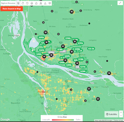
Trulia has built in this neat Google Maps API using an overlay of reported crime data provided by SpotCrime.com and CrimeReports.com. Whether you are a renter or homeowner, this neat display allows you to see up-to-date crime stats in your neighborhood. And, if you're in the green, you are probably safer but as their map will show...it's all relative to the type of crime. Despite it's lack of sprawl or urbanization, all downtown areas tend to have higher crime rates than its outlying neighborhoods or adjacent cities. Vancouver is, by no means, a young city, having been incorporated in the mid 1800s.

In the Northwest, people get reported missing all the time. This is because it is easy to get into the sticks if you live in a neighborhood that borders a green way. Most of those who do go missing are endangered youths or the elderly with dementia related illnesses. You can probably toss those crime data points out when doing neighborhood comparisons (e.g., comping a neighborhood).

Here is a snapshot of the crime heat map of Vancouver, WA.

Trulia.com - Crime Heat Map of Portland Metro Area, Vancouver WA

Brexit and Tourism

One might say that fear rules the global stock exchanges. Britain was and still is a great country and a leading economic indicator (not being a mere follower) of what we know as western Europe. For countries that cannot compete in terms of GDP, labor population, or sheer magnitude of the economic girth of first world nations; the concept of sharing labor pools (along with labor law restrictions), trade, and distributed wealth (in terms of country-to-country financial loans) seems like a really good idea...that is if the demand for products and services produced by your home country can keep up with all the other countries within that trading region.

In 1998, I took my first trip outside the US; specifically to visit a few countries along the western Caribbean. While food was ridiculously cheap on the eastern coast of Mexico, the same could not be said for the island nations that were still on the British standard of currency. A conch sandwich and a small bowl of turtle soup costed £16 (more than $25 US). 

The single biggest benefit to Americans is the rising strength of the US dollar against the British pound and the Euro; effectively making European goods/services cheaper to acquire. The closer we get to a 1:1 ratio, the cheaper it is for Americans to travel to the UK and Britain-managed territories. This isn't limited to travel. Foreign car imports will also be cheaper than they are now. Our domestic automotive dealerships benefit from the weakening Euro in this regard. However, it is still ridiculously expensive to travel from the US to Europe with air fares at more than $1,500/pp one-way.

Something else to consider are the other wealthy European countries that were never part of the EU and continue to flourish such as Norway, Switzerland, Iceland, Turkey, and others

At the time I wrote this, the currency exchange rate was::
$10 USD = £ 7.57 = € 9.08

In 1998, $10 USD = £ 6.50 
In 2008, $10 USD = € 6.50

If you are an infrequent international traveler, you might think to yourself: Meh, what's the big deal with paying a little bit more for the experience, for goods/services that are only available in the visited country, etc.

Microsoft doesn't just acquire companies

$26.2 B looks reasonable for the patents and trademarks that Microsoft is acquiring with its latest purchase. Why build software yourself when you can buy it cheaper from someone else? Besides, this is an acquisition war for enterprise software and LinkedIn is not just a software platform for recruiters and job seekers. A stockpile of cash doesn't do anyone any good if it just sits around collecting interest. $26.2 is a price that no one being acquired would complain about. You might even consider this purchase a waste if you were writing for Forbes. But, that is not the case. Here's what Microsoft also gets with that deal.

CXO talent:
  • Jeff Weiner is retained as CEO of subsidiary LinkedIn (ranks at #5 on Glassdoor's Highest Rated CEOs in 2016) - how does that saying go? Employees quit leaders, not companies (via TalentCulture). This is a retention tactic used by Warren Buffett, who often lets senior management stay at the acquired company if that company is managed well.
LinkedIn's Patents (source) - only adds to Microsoft's girth of patents and trademark holdings

LinkedIn's acquisitions (source):
  • 15 Digg patents (purchased for a mere $4 M)
  • mspoke
  • ChoiceVendor
  • CardMunch
  • Connected
  • IndexTank
  • Rapportive
  • SlideShare
  • Pulse
  • Bright
  • Newsle
  • Bizo
  • Careerify
  • Refresh.io
  • Lynda.com
  • Fliptop
  • Connectifier

The other cake trimmings:
  • This is the primary feature that sets LinkedIn apart: it allows online services to be marketed to users within a network. Many companies struggle with this concept and network-wide implementation.
  • LinkedIn's app portfolio - mobile authentication, user feature that allows attachments from mobile phones, user feature that effortlessly allows users of any status (basic, premium) to connect with any user on LinkedIn's primary platform. Apps include:
    • LinkedIn - a lite version of the LinkedIn website for users, a basic user lookup tool
    • LinkedIn Lookup - a bio-hacker for professionals for skills and experience
    • Lynda.com - eLearning on the go
    • LinkedIn SlideShare - shareable presentations
    • LinkedIn Groups - professional and industry interest networking
    • LinkedIn Pulse - business news
    • (premium) LinkedIn Recruiter
    • (premium) LinkedIn Sales Naviator - the sales lead engine for selling on LinkedIn
    • (premium) LinkedIn Elevate - reputation building by content sharing
  • The LinkedIn Brand - the web/mobile properties under the LinkedIn umbrella have mostly been well managed, both from an integration and public relations perspective; nothing bad can happen from adding this to the Microsoft portfolio, unless the integration between the subsidiary and the parent fails to mesh
The acquisition makes sense. Who else could have purchased LinkedIn? Any of the top 50 companies amassing stockpiles of cash.

And as for LinkedIn's 9,200 employees? I expect nearly all of them to get laid off at some point as Microsoft sheds dead weight from overlapping operations it wasn't keen on picking up with this purchase.

Finally, a real bilingual In-Video Ad

A month before Fox.com's interactive video ad player tried to show bilingual ad for Walgreens, except it was bilingual in ad text only. This new ad from JcPenney had an actual link to view the video in Spanish. The core ad still targets minority women in their 20s and 30s with children, then translated to Spanish. Overall, a good execution strategy for JcPenney.

Fox.com JcPenney bilingual video ad

Managing a Social Feed

I started a Twitter feed when I was working at OpenSesame as its marketing automation manager and used it to keep track of elearning and online training articles. At first, it was fun getting other users in the elearning industry to follow me back and I even won a really fancy box of donuts for my workplace for participating in a social media promotion for promoting a company's webinar.

That aside, I've taken a more hardline approach to managing this feed. I've gone beyond the simple follow and unfollow.

The rules of Twitter feed @SerenaHsiMktg:

If you are a Social Media follower seller - you get muted, not followed
If you are tweeting in a non-English language - followed and muted
Porn stars - muted, not followed
All followers followed have retweets turned off

Lately I've noticed that a lot of users with more than 5k followers are stacking their follower numbers by following and unfollowing other users, hoping that other users are not as vigilant as they are in unfollowing. This gives the Twitter community the impression that the one with the most followers has the most reach; which, in part is very true.

Follow me, I follow you back
Follow me, I follow you, unfollow me, I unfollow and mute you
Follow me again and I unfollow and block you (because you are already muted, I can see that you are trying to stack your follower count)

There are paid add-ons that do some of these steps, but not for repeat visit follows requests. For now I'll just manage this feed monthly or whenever I get around to it. Costs me about 10 minutes--which does add up over the course of a year. Maybe I should consider using an app add-on with automated settings to manage follows and unfollows.

And all those Twitter in-app messages? I don't read any of them.

Is there a goal for this feed? Probably not. Though, I've expanded article links to include all business and technology topics that are interesting. It just is a feed of what I happen to be reading at the time.

Where's Astro Now?

This Salesforce campaign is quite a bit more elaborate than the Cloak of Adventure quest. The marketing group that put this together included a lot more engaging content to help you on your way to finding Astro. The language is playful and the goal remains as simple as ever: do x achieve y.

In this case, we are learning about the ability to tag contacts with geolocation data: longitude and latitude. Once these fields are created and if you are going to import/export data, you must use the same format for longitude/latitude should you get around to using it to manage your sales territories. You can't mix and match geolocation data sets. You must use the same nomenclature and format. Just a FYI.
Your mission should you decide to accept it...
While I still have yet to complete building my Battle Station console (I got lost part way and I can't figure out the errors I'm getting), these later adventures that Salesforce is putting out is a fine method of helping customers retain training knowledge.. in a learn by doing series of steps.

Applying for and obtaining a Salesforce developer account is independent of being a Salesforce customer. If you didn't already know this, now you do.

I wanted an Astro sticker for completing this mission. Sadly, I'll just have to do with her picture badge.
Salesforce's Astro

MTM Organic Traffic

Traffic to my food blog is driven mostly from organic searches on Google search. There are some outliers to that data set and I'm beginning to think that my GA dashboard is flawed, my understanding of GA metrics is flawed, or something else is flawed. Mostly, this is because I don't do any paid search, SEO, or white/black/grey hat SEM for my food blog. 

Just this year I started looking at referrals from social platforms -- currently accounts for a tiny speck of traffic from Twitter and Pinterest, far less than 1% of all session traffic.

Impact of Acquisitions on Customers

Through an exploratory interview with Endurance International, the parent company of branded website hosting services such as Domain.com, BlueHost, TypePad, and more than 50 other brands, I learned of their $1.1B acquisition of Constant Contact. This sure beats the default listserv capabilities that comes default with web hosting. Endurance manages its brand properties as independent companies; e.g., the same way Honda is Acura, Toyota is Lexus, Peet's is Stumptown Coffee and Salesforce is Pardot. The business practice of allowing each subsidiary to maintain a brand identity independent of its parent is more commonplace than you think. 

The basics:
  • 650k worldwide Constant Contact customers
  • 90k net new hosting subscribers per quarter
  • CC acquired 5% new customers from Endurance partnership before the acquisition

Interactive Interstitials

Just like GIF ads have made a remarkable comeback, so have interstitials. 

In this instance, Fox.com is experimenting with in-video clickable ads. It doesn't seem like much but it's a baby step in what will be a long evolution of how end users are able to interact with brands. At the moment, advertorial interaction is optional -- to go beyond just clicking once on the ad space with your mobile video player.
Fox.com Interactive Ad

Fox.com's video player allows viewers to view ads in one of two formats:
1. Watch and interact with a 30-second commercial; or
2. Do nothing and view the video with regular commercial breaks, about 2.5 minutes of ads


However, given the number of commercial breaks, the viewer isn't saving that much time away from the streaming content. So far, I've only seen Fox.com with interactive ads. There are ads of a similar nature on Hulu.com; but these direct you away from the site when you click on them.

Here's an example of Walgreen's interactive ad. Even after watching the ad several times, I have no idea what it's about. But it features two women talking about something. The interactivity asks you if you want to view the ad in Spanish or English. Having been raised by the public school system in California, Spanish is a second language. If you click onto "Spanish", only the text at the top changes to Spanish and the video plays in English with no Spanish subtitles, speakers, or dubbing. It was a very disappointing feature. Or, perhaps streaming video technology switching isn't quite there yet for on-demand custom video plays.
Fox.com Walgreen's Ad - part 1

If a user clicks "English" play the default ad; if a user clicks "Spanish" play the Spanish speaking ad. One would hope user engagement would be as simple as that.

The Walgreen's ad falls short of the basics.

Fox.com Walgreen's Ad - part 2
In retrospect, I'm not sure how viewers are expected to leap from a Black woman eating something on the kitchen floor with a skateboard in the background to a couple of Caucasian millennials out walking. What was the point of the ad??

Cloak of Adventure Campaign via Salesforce Trailhead

Of all the community engagement sites that I've participated in, the Salesforce Trailhead site is the most amusing. Kudos to the teams that put this together. 

Last summer, Salesforce offered free developer access to their Salesforce platform. This was great because it gives access to learn more about the platform from the admin side; plus learning opportunities for different levels of SFDC usage (basic, admin, and developer).

The Cloak of Adventure quest starts harmlessly enough through a Trailhead branded email invite:
2016-01 SFDC Email Invite - Trailhead Badge Contest
Engagement is simple. Enroll in the contest (via Pardot web contact form). Complete training modules (a mix of multiple choice questions or performing setup steps within SFDC developer edition). Earn badges. Once you meet the contest requirements, a second email is sent asking for your mailing address details (also fulfilled using Pardot).

Easy. Simple. And, a quick way to engage users in SFDC's self-service training modules.


Marketing Automation: Basics

Choosing the right platform for your business is half the battle. And, not all the bells and whistles of a solution intended for large enterprises such as Marketo or Eloqua are right for your small business. 

You want to consider marketing automation when that static web contact form just doesn't work for you anymore; or there are so many unqualified inquires that you need some other way (other than manual oversight by a human being) to follow-up with them all in a timely and reasonable manner. 

Here are some basic built-in features to look for in an entry-level marketing automation platform:

- customer segmentation
- lead scoring (critical for B2B; sometimes used for high end prosumer products)
- automated campaigns
- marketing and/or sales automation
- landing pages

Nearly all email marketing and marketing automation platforms have email marketing (basic and custom templates). integration or APIs with popular CRM tools, email/web/or social campaigns, and some form of web or campaign analytics.