Pre-populated Web Contact Forms

I don't know what's worse at the moment, being forced to register for each real estate website where I want to browse a listing or having fake contact data pre-populate when an online account is generated by an agency's contact management system. From time to time, I'll comp neighborhoods around where my rental is located to see if housing prices of the existing home supply (vs new housing starts) are rising, falling, or staying the same. The web contact form lead wall with Keller Williams is just one of those examples of a poorly thought out lead generation plan. I'm not sure why their web form thought I'm from NY, but it does. Unfortunately I have seen this type of web form behavior before where the back-end software captures and saves the contact info of the most recent transaction; in this case, a user from NY.

Here is an example of a pre-populated customer account that you probably don't want replicated with your own website:
Keller Williams: post-login from new account creation, user account profile
And, to make it worse, you actually do have to check your account profile to see what email items the opt-in signs you up for because while there was only one checkbox to opt-in for email marketing, there were three options from KW. See below:

Surely, much success can be attributed to this lead gen program in terms of quantity of lead generated and number of validated email addresses that are added to one's in-house or partner email list. But, I'm not sure what they really mean by a trusted mortgage partner. There's also no double opt-in upon signing up, like a confirmation of an email address for starters. That's bending the opt-in rules a bit. Banks, insurance, and credit card companies do it all the time because they have subsidiaries or divisions that do partner-like activities. Also, there's no mention about a privacy policy or data usage policy on a user's account profile, or how to find out more info about it.

It's unclear from the web page's source code if this is a home-grown web form or hosted by a third party provider. I'm not terribly inclined to check out other KW agency websites to test this out.

Snail Mail and Why We Love It

Why marketers love it is because it's a very well established mailing standard. Every property (and even those with just a box) has a postal address and you know that when spelled and annotated correctly, it has a 100% chance of getting delivered intact and mostly on time to the intended recipient, "to our neighbor", or "valued customer".

Why people love it is because it is an interactive communication piece with a tactile response. It's even better when it's personalized just for you; and, for the most part, it doesn't matter if it comes from a business or from a friend, although we like the latter part even better.

There are a lot of "standards" that just haven't died; although some who believe that everyone should be connected to everyone else online all the time want you to believe that it already has. The radio (118 yrs old). Fax machine (163 years, or for modern purposes 63 years). Libraries. Copiers. Telegrams. Land line telephones, etc.

Despite how traditional is trending against digital, according to the Direct Marketing Association's 2012 Response Rate report, the cost per order or lead acquisition costs were about the same regardless of the method used: direct mail ($51.40), postcard ($54.10), email ($55.24), and paid search ($52.58). Hmmm. Makes one wonder what's going on here.

It basically boils down to this:


Email
Mail
Phone
Lower response
Higher response
Highest response
Lower cost
Higher cost
Highest cost

Every marketing channel has its pros and cons, but what marketers and new entrants in the market need to be aware of is a) who you are trying to reach, and b) how much are you willing to spend on your campaign.

Foursquare Day

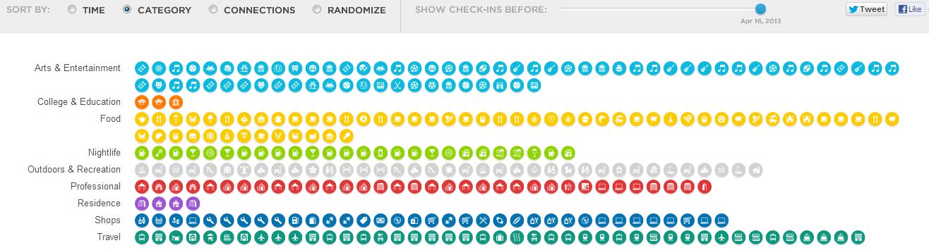
For those of you who may not know (or care), April 16 is Foursquare Day; largely an event promoted by mobile for Foursquare users to meet and mingle at various places. But, this post isn't about that. It's about their visualization tool that shows what you've done for a year. There are just four preset visualizations and they aren't all that helpful for anyone, including the user. If only I could download this or geographically see where I've been, or what cities I've been to have the highest concentration of unlocked badges. The Foursquare network is still growing and provides an alternate means of tracking hyperlocal ad redemption.
A Foursquare Visualization.
Pretty cool looking, utterly useless


Another Foursquare Visualization.
This one shows quantity by venue type,
with no indication if you've visited a place more than once.

Google Treasure Hunt - Map Layer

Even for an April Fool's joke, this is a pretty neat map layer feature. Google Maps already allows you to view terrestrial maps at street level, terrain based, or from above via satellite imagery. This map view reminds me of ye olde mappes that one would find in a pirate or seafaring game. The below image is a screenshot of the greater Seattle area. Nicely done Google.
An April Fools treasure map display from Google,
the marked spot on this map is a trailhead at Cougar Mountain
near Issaquah, WA
Google's promo video for this feature is very amusing:

Google Takeout

Looks like Google is pulling the cord on its RSS Reader. It isn't as bad as it sounds. There are plenty of other RSS readers out there. Frankly, their RSS works a lot better than say Google News which I wish offered more customization. If you have a lot of subscriptions that you keep up on, say between the Wall Street Journal, NY Times, or the various food or business sections of other major newspapers, keyword or new blog post alerts, Google's other lesser known service Google Takeout lets you download an XML archive of your subscriptions and feed settings.

Takeout isn't limited to just the reader, you could download a backup of Google Drive, Blogger, Picasa, or Youtube for example.

To access Takeout, simply access one of Google's web services, say from Google Reader:

Go to Settings / Reader Settings / select the Import/Export tab

Then click onto the link below which reads: Download your data through Takeout

Bait and Switch


Southwest Airlines' March Facebook campaign is currently promoting $59 one-way flights. Except, I can't fly out from a major metro area to another major metro area for that price. And while $93/flight is a good price, it's not even close to the sweet FB deal. This is a good way to tick off customers who aren't loyal to the brand. What's worse is that the landing page that houses this offer has the cities in alphabetical order; a logical way to default sort it, but the flight prices are so not on "sale" for most one-way flights. I feel like I've been misled, again, by a deceptive sponsored ad.

The sponsored ad starts pretty well with all the right components in it that communicate brand, offer, and a call-to-action.

Sponsored Ad screenshot, 2013-03-08
And then, after the hook (click-through), the experience quickly nosedives into the ground.
Landing page mirrors the FB-pushed ad. Good right? Keep scrolling down...
You think you are going to get a good deal, until you can't actually find a deal for your metro area. Seattle, for example:

If Southwest had used regional ad targeting on FB,
I would not have been pitched this offer.
Maybe? One could only hope social media ad tech advances to this level.


Real-time Crowd-sourced Incident Dashboard

Because the stakes are high (loss of life, financial disruption, loss of property), many countries, cities, and private citizens have devoted time and resources into developing this global network of seismic tracking and archiving.

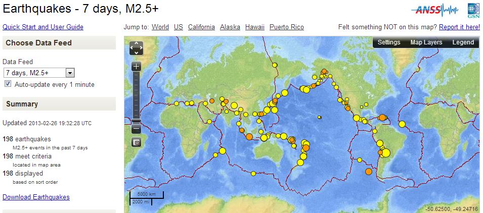
It would be great if an easy-to-use interactive dashboard for businesses tracked activities such as real-time sales pipeline flow, new product activation or purchases, campaign effectiveness, budget vs actual spends, etc. The visualization below is from the USGS and it tracks all earthquakes that happen around the world. It can be filtered to show either all magnitudes or 2.5 M and above, and within the last 7 or 30 days. And, this map display has evolved over the past several years to what it is today. There is a beta mobile version of it, though it doesn't seem to spew out useful data to a casual observer. 

USGS: real-time display of 2.5M earthquakes
While there aren't major fault lines running through the Pacific northwest like in California, this regional display (click to view) shows where earthquakes have occurred in the last two weeks.

Interested in other data projects from the USGS? Here are a few more links that show how the earthquake data is crowd-sourced: