Google Analytics + Google Data Studio

Saw a promo email for Data Studio today and thought I'd check it out...

Google Data Studio: Start Here page

One of the help files for this web tool reads as follows..

"A Data Studio report is a collection of components that inform the viewer using data derived from one or more data sources. Components include charts, annotations (text), and graphical elements (shapes and images). Data Studio components can be styled and configured to present exactly the view of your data you want. Data sources get their data from a data set, such as a Google Analytics view, a Google Sheet, a BigQuery table, etc."

Don't take this the wrong way, but I think Google is trying to get onto even ground with Salesforce Dashboards. None of this point and click setup is all that hard; nor too complicated to understand. I don't think user adoption would be that big of an issue for companies. It  also looks like Google is competing with Tableau's ability to aggregate and visualize data.

Google Data Studio - Data Viz of World Population (orange),
Internet Users (blue), and Mobile Subscriptions (yellow)
The intro email says it succinctly:

"No more requests for data. No more emailing around CSV files and spreadsheets. No more static and outdated reports. Finally, a reporting solution that works the way you work."

It was rather amusing that we were doing just that in a corporate setting, mucking around with CSV exports and spreadsheets to get a report to look the way we wanted it to. 

Spot on, Google Analytics team.

Amazon: Resizeable Inline Video

I log in fairly regularly to Amazon to purge my Kindle of its expired borrowed library items. But today, wow. I am flabbergasted at the video display ad Amazon has on its front page. I am sure Amazon is working some cookie magic on the back end for this new UI display. 

Ok, what caught my eye was a short clip of a woman wearing a blue dress, except it wasn't static nor choppy like a GIF. Actually, it looked like one of those in-screen presenters you see on some webinars; except she's modeling a dress and the dress moves! Or, she was slow dancing, who knows.
2016-08-23 Amazon Homepage
Looks good on Windows 10 desktop. I don't think I'd have the same shopping experience with their mobile app.

Personally, I would not have dedicated so much space to a secure login in the pre-login startup screen on Amazon's main homepage. But, it gets worse and it's probably a not-yet-fixed bug feature. Both login buttons (top and body left) open to a giant blank screen with Amazon's characteristic login box; except, there is zero branding on the page. No headers, no footers, and heck no header logo. Imagine a blank white web page featuring just a login box. Not even WordPress looks this minimalist.
Way to go Amazon.

Back to your regularly scheduled programming.

Yelp: New restaurant search feature - PokeStop

Yelp shows it can be hip too by adding PokéStops as a searchable restaurant feature.


Bitly's Dark Traffic

Saw this on my Bitly dashboard:


Bitly Tracks Dark Traffic
Looks like my top traffic channel is from the dark social web; or basically links that web analytics tools are unable to track. This is curious because I use Bitly almost exclusively as a link shortener on social media sites. At least Google Analytics knows what traffic comes from mobile, device type, or network source. Personally, it just reads like a bad programming error or laziness on the platform's part.

Bitly's blog suggests that 70% of all online referrals (source) come from dark social.

You'd think that if you shortened a link from a news source's native domain, that it would be easier to track. Or, even if you copied someone else's shared link and stripped out their tracking code, that Bitly would be able to track the comings and goings from your Twitter account to a hosted domain.

Alas, whatever Bitly is failing to track it is annoying. This is what I'd call junk analytics. 

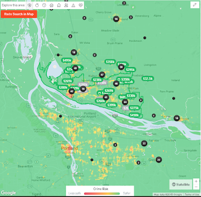
Comping a Neighborhood - Crime Risk

Trulia has built in this neat Google Maps API using an overlay of reported crime data provided by SpotCrime.com and CrimeReports.com. Whether you are a renter or homeowner, this neat display allows you to see up-to-date crime stats in your neighborhood. And, if you're in the green, you are probably safer but as their map will show...it's all relative to the type of crime. Despite it's lack of sprawl or urbanization, all downtown areas tend to have higher crime rates than its outlying neighborhoods or adjacent cities. Vancouver is, by no means, a young city, having been incorporated in the mid 1800s.

In the Northwest, people get reported missing all the time. This is because it is easy to get into the sticks if you live in a neighborhood that borders a green way. Most of those who do go missing are endangered youths or the elderly with dementia related illnesses. You can probably toss those crime data points out when doing neighborhood comparisons (e.g., comping a neighborhood).

Here is a snapshot of the crime heat map of Vancouver, WA.

Trulia.com - Crime Heat Map of Portland Metro Area, Vancouver WA